Google Forms response charts: what the Summary tab actually shows
Last updated September 2026 · ~9 minute read
Short answer: Google Forms draws charts for you automatically in the Summary tab, and Google's own words for what you get are deliberately loose — “Response summaries show full text responses or charts for each question.” Some questions become a chart, some stay as a list of text, and Google never publishes which is which. The Summary tab is a fast read of one question at a time. The moment you need to compare two questions, it is the wrong tool.
This page is about the Summary tab itself — what Google documents, what it conspicuously does not, and the two settings-level surprises that catch people out: who else can see your charts, and what happens when a form gets very large.
How we checked
Everything quoted below is lifted from Google's own Docs Editors Help centre — the “View & manage form responses” page and the “Publish & share your form with responders” page — rather than from tutorials or memory. Where Google is silent, this page says so instead of filling the gap.
The three response views
Google documents three tabs inside the Responses section, and they answer three different questions:
- Summary — the aggregate view, one block per question, and where the automatic charts live. Google notes a precondition most people meet without noticing: “The ‘Summary’ tab displays on a form only when there's one or more responses.” An empty form has no Summary tab at all.
- Question — one question at a time, showing every answer given to that single question. Useful when a chart flattens something you need to read verbatim.
- Individual — Google's description is “Find answers by person or, if you allowed people to submit the form more than once, by submission.” This is the one submission-shaped view: everything one respondent said, in order.
Summary answers “what did everyone say?”. Question answers “what did everyone say to this?”. Individual answers “what did this person say?”. If you are scrolling the Summary tab hunting for one person, you are in the wrong tab.
What Google does — and does not — document about the charts
Here is the honest state of the documentation. Google says summaries contain “full text responses or charts for each question”. That single sentence is the entirety of the promise. It tells you two useful things: charts are generated for you with no configuration, and not every question gets one — some are rendered as text instead.
What Google does not publish is a mapping from question type to chart type. There is no table in the help centre saying multiple choice becomes a pie chart, checkboxes become horizontal bars, and linear scale becomes a column chart. Plenty of blog posts assert exactly that, and they may be describing what they saw on the day they wrote it — but it is not documented and it is not a commitment. We are not going to reproduce a mapping table we cannot source.
What you can do instead is check your own form in about ten seconds: open Responses → Summary and scroll. Whatever is there is the ground truth for your questions, your answer counts and your current version of Forms. Two things worth noticing while you scroll:
- Long-answer and short-answer questions generally do not chart. Free text has no categories to count, so the summary shows the responses themselves. This is consistent with Google's “full text responses or charts” phrasing.
- The rendering can depend on your data, not just your question type. A question with a handful of distinct answers and one with hundreds are not the same charting problem, and Google reserves the right to present them differently.
Copying a chart out
Google documents copying summary charts, not downloading them: “If your form creates charts in your ‘Responses’ section, you can copy and paste them into other files.” The documented route is the copy button at the chart's top right, then paste into another Docs-editors file — and Google adds that you can then “update the chart directly” from the doc, presentation or drawing as long as you have edit access. There is no documented “save as PNG” in the Forms web editor.
Does the summary update live?
Google does not document a refresh behaviour for the Summary tab either way, so we will not claim one. In practice the summary reflects responses received; if you are watching a form during a live event, reload rather than trusting an open tab to have kept up.
Who else can see your summary
This is the genuine surprise on this page, and it is a privacy question rather than a charting one. There is a Forms setting called View results summary, under Settings → Presentation. Google's warning is worth reading twice:
“After someone fills out your form, they get a link to the results. Response summaries show full text responses or charts for each question and are visible to anyone who can respond to the form.”
Note full text responses. This is not a setting that shares tidy anonymised percentages. If respondents typed anything into a paragraph question — a complaint, a name, an email address they volunteered, a comment about a colleague — turning on “View results summary” puts it in front of everyone who can open the form. Anyone who can respond, not just people who did respond.
It is off by default and one toggle away from on, which is exactly the combination that produces accidents. If you are running feedback collection, exit surveys or anything where people assumed they were writing to you alone, verify this setting before you send the link — and again after anyone else edits the form.
What happens at scale
The Summary tab has an upper bound, and Google states it plainly: “If you don't find the response summary, it can be because your form has more than 50,000 responses.”
That is worth internalising because of how it fails: the summary does not warn you, degrade, or show a partial chart. It is simply not there. A form that had charts last month can quietly lose them, and the usual assumption is that something is broken rather than that the form outgrew the feature. Nothing has broken — your responses are still collected and still exportable; you have passed the point where Forms will aggregate them for you in the browser.
Fifty thousand is one of several thresholds a busy Google Form runs into, and the others behave differently. We keep them together in Google Forms response limits rather than repeating them here.
When the summary is the wrong tool
The Summary tab is a univariate view: it charts one question across all responses, and that is all it is designed to do. It has no documented way to filter to a subset, compare two questions, or segment by anything. So the moment your question sounds like one of these, close the tab:
- “How did the people who chose Option A answer question 6?” — that is a cross-tabulation.
- “What did last week look like versus this week?” — that is a filter on a timestamp.
- “Which department is most dissatisfied?” — that is a segment, then a comparison.
- “What is the average score, excluding blank submissions?” — that is a formula over filtered rows.
No amount of staring at a pie chart will answer these. They are spreadsheet work: get the raw rows out and pivot them. Our guide to exporting Google Forms to Excel covers getting the data into a shape where cross-tabulation is a two-minute job. If you only need to read responses rather than analyse them — on a phone, between meetings — that is a different job again, and seeing Google Forms responses on your phone is the guide for it.
Summary tab or spreadsheet?
| Forms Summary tab | Spreadsheet export | |
|---|---|---|
| Setup required | None — charts are automatic | An export, then a pivot table |
| Chart type | Chosen for you; not documented | Yours to choose |
| One question at a time | Yes, always | No |
| Compare two questions | No | Yes |
| Filter to a subset | No | Yes |
| Above 50,000 responses | Summary may be unavailable | Still works |
| Getting a chart out | Copy & paste into a Doc | Any export the tool supports |
Reading summaries in Forms+
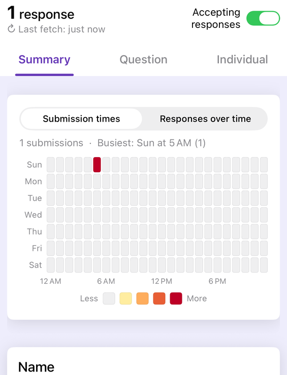
Forms+ is a native iPhone and iPad client for your real Google Forms, and it mirrors the same three-way split Google uses: a Summary, Question and Individual selector across the top of the responses screen, so the mental model carries over unchanged. It renders its own summary charts rather than embedding the web view, and — unlike the web summary — the chart type is yours to change, alongside copying, saving or sharing a chart from the phone.
It also adds the two things the Summary tab structurally cannot do: an Answer rate view for completion and skip rates per question, and a filter that narrows responses by date, email, question or score before you read them.
Your response charts, on the phone in your pocket
Forms+ reads and charts the responses to your real Google Forms — your account, your Drive, no migration.
Get Forms+ free on the App StoreFrequently asked questions
Which chart does Google Forms use for each question type?
Google does not publish a question-type to chart-type mapping anywhere in its Forms help documentation. The help centre says only that “Response summaries show full text responses or charts for each question” — it never lists which questions get a pie chart, which get bars, and which get plain text. The reliable way to know what your form produces is to open the Summary tab and look, because the answer can also change with the shape of your data.
Why is there no Summary tab on my form?
Two documented reasons. Google states that “The ‘Summary’ tab displays on a form only when there's one or more responses”, so a form with zero responses has nothing to summarise. It also states that “If you don't find the response summary, it can be because your form has more than 50,000 responses.” Below one and above fifty thousand, the tab is not there.
Can respondents see my Google Forms charts?
Only if you turn on the setting called “View results summary”, found under Settings then Presentation. Google warns that “After someone fills out your form, they get a link to the results. Response summaries show full text responses or charts for each question and are visible to anyone who can respond to the form.” That includes free-text answers, so check the setting before collecting anything sensitive.
Can I export or download a Google Forms chart?
Google documents copying, not downloading. Its help page says “If your form creates charts in your ‘Responses’ section, you can copy and paste them into other files”, using the copy button at the chart's top right and pasting into a Doc, presentation or drawing. There is no documented button that saves a summary chart as an image file from the Forms web editor.
Can I filter or cross-tabulate the Summary tab?
No. The Summary tab charts one question at a time across every response you have collected. It has no documented way to filter to a subset, to compare one question against another, or to segment by respondent. Anything comparative belongs in a spreadsheet, where you can pivot and cross-tabulate the raw rows.